Graphs can help patients and doctors see healing over time
Important points
One format better describes patients’ quality of life after transplant
One format better describes patients’ quality of life after transplant
Using certain graphs can help patients understand their health and quality of life after transplant.
Blood or marrow transplant can cure some cancers and other blood disorders, but it also can have serious effects.
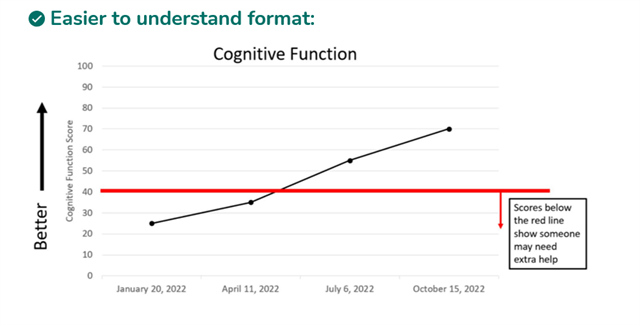
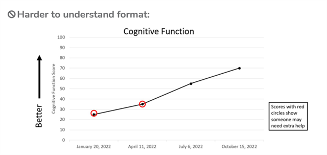
Sometimes, it’s easier to show changes using pictures instead of words. However, graphs can be hard to understand. Researchers wanted to know how best to show patients how their quality of life has changed after transplant.
About 250 patients, caregivers, and health care providers took a survey about 2 different graph formats, and some people also volunteered to discuss the graphs.
Each graph showed changes that a patient might report about their own health and quality of life over time. About 8 out of every 10 people agreed that one format was much easier to understand. This graph format showed a red line below which a person might need extra help.
Keep in mind
Programmers and doctors can work together to add useful graphs to electronic medical records and use them as tools to help patients and doctors decide what care is needed.
This plain-language summary was written by Jennifer Motl at the Medical College of Wisconsin and reviewed by an author of the full article. ©2025 by CIBMTR, license CC BY-SA 4.0.
Source
Cusatis R, Kapfhammer M, Rein L, et al. Visualizing Health Related Quality of Life (HRQoL): understanding comprehension of HRQoL graphs in the allogeneic hematopoietic cell transplant setting. Journal of Cancer Survivorship. 2026 Jan 9. doi: 10.1007/s11764-025-01941-y. Epub ahead of print. PMID: 41511743.
About this research summary
CIBMTR® (Center for International Blood and Marrow Transplant Research®) thanks study participants. This information is provided on behalf of the Consumer Advocacy Committee of CIBMTR. CIBMTR is a research collaboration between the Medical College of Wisconsin and NMDP.